July 24, 2025
Integrating Art Deco Elements into Typewriter Keycap Designs
The Timeless Allure of Art Deco
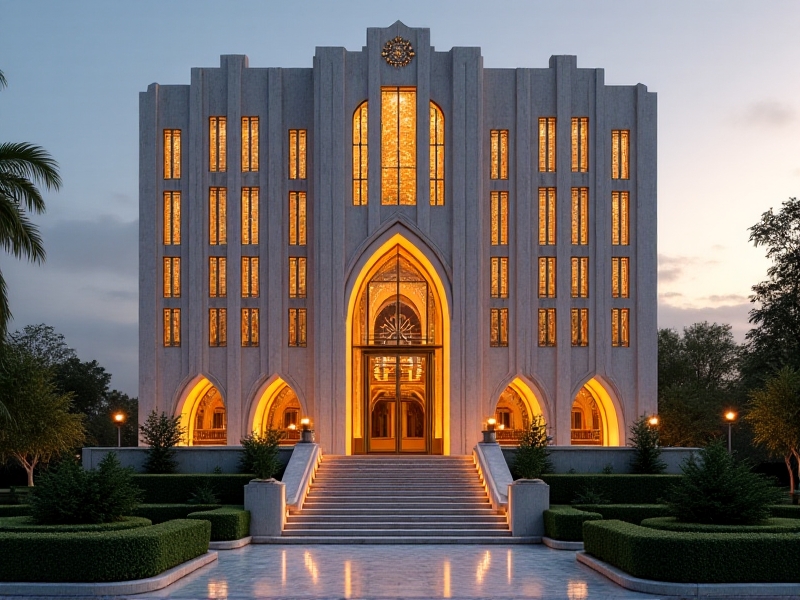
Art Deco, a design movement that emerged in the early 20th century, is renowned for its bold geometric shapes, luxurious materials, and intricate detailing. Originating in the 1920s and 1930s, Art Deco was a response to the rapid industrialization and the desire for modernity. It became a symbol of sophistication and elegance, influencing architecture, fashion, and even everyday objects. The movement's emphasis on symmetry, streamlined forms, and opulent finishes makes it a perfect candidate for integration into modern design elements, such as typewriter keycaps. By blending the timeless allure of Art Deco with the functional aspect of keycap design, we can create a unique fusion that pays homage to the past while embracing the future.

The Anatomy of Typewriter Keycaps
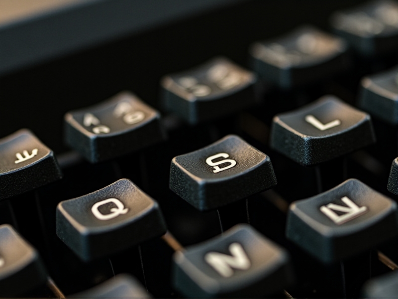
Typewriter keycaps are more than just functional components; they are the interface between the user and the machine. Traditionally, keycaps were designed with a focus on durability and legibility, often featuring simple, sans-serif fonts and muted colors. However, as mechanical keyboards have gained popularity among enthusiasts, the aesthetic potential of keycaps has become increasingly apparent. Custom keycap sets now offer a wide range of designs, from minimalist to ornate, allowing users to personalize their typing experience. Understanding the anatomy of keycaps—such as the keycap profile, material, and legend style—is essential when considering how to integrate Art Deco elements into their design. By carefully selecting these components, we can create keycaps that are both visually stunning and highly functional.
Art Deco Aesthetics in Modern Design
Art Deco's influence on modern design is undeniable. Its signature elements—such as geometric patterns, stepped forms, and sunburst motifs—have been reinterpreted in contemporary architecture, interior design, and even digital interfaces. The movement's emphasis on luxury and craftsmanship resonates with today's consumers, who value both aesthetics and quality. When applying Art Deco aesthetics to typewriter keycap designs, it's important to consider how these elements can be adapted to a smaller scale. For example, the use of metallic finishes, intricate engravings, and bold color contrasts can evoke the opulence of Art Deco while maintaining the functionality of the keycaps. By drawing inspiration from iconic Art Deco designs, such as the Chrysler Building or the works of Tamara de Lempicka, we can create keycaps that are both visually striking and deeply rooted in design history.
Designing Art Deco-Inspired Keycaps
Designing Art Deco-inspired keycaps requires a careful balance between form and function. The first step is to select a color palette that reflects the movement's signature opulence, such as black, gold, and deep jewel tones. Next, the keycap profile should be chosen to complement the Art Deco aesthetic; for example, a stepped or sculpted profile can mimic the layered forms often seen in Art Deco architecture. The legends on the keycaps should be designed with Art Deco typography in mind, featuring bold, geometric fonts that are both legible and stylish. Additionally, incorporating intricate engravings or embossed patterns—such as chevrons, sunbursts, or zigzags—can add a touch of luxury to the design. Finally, the material of the keycaps should be selected to enhance the overall aesthetic; for instance, using high-quality ABS or PBT plastic with a matte or glossy finish can create a sense of depth and richness. By thoughtfully integrating these elements, we can create keycaps that are a true homage to the Art Deco era.
The Role of Typography in Art Deco Keycap Design
Typography plays a crucial role in capturing the essence of Art Deco in keycap design. The movement's typography is characterized by its bold, geometric forms, often with a sense of verticality and symmetry. Fonts such as Broadway, Bifur, and Metropolis are quintessential examples of Art Deco typography, featuring sharp angles, streamlined shapes, and a sense of modernity. When designing keycaps, it's important to select or create a font that embodies these characteristics while maintaining legibility at a small scale. The legends on the keycaps should be crisp and clear, with a strong contrast between the lettering and the background color. Additionally, the placement of the legends should be carefully considered to ensure that they align with the overall design aesthetic. By paying close attention to typography, we can create keycaps that not only look beautiful but also enhance the user's typing experience.
Material Choices for Art Deco Keycaps
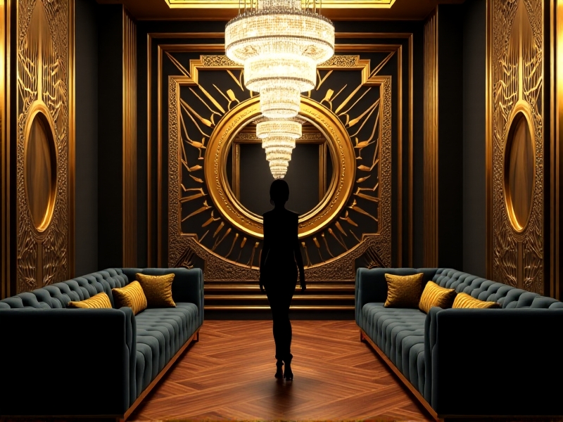
The choice of materials is a critical aspect of designing Art Deco-inspired keycaps. Art Deco is synonymous with luxury and craftsmanship, often featuring materials such as polished metals, exotic woods, and precious stones. When selecting materials for keycaps, it's important to consider both the aesthetic and functional properties. High-quality plastics, such as ABS or PBT, are commonly used for keycaps due to their durability and ease of customization. For a more luxurious feel, metal keycaps made from aluminum or brass can be used, offering a weighty, premium experience. Additionally, the finish of the keycaps can greatly impact the overall design; a glossy finish can create a sleek, reflective surface, while a matte finish can provide a more subdued, elegant look. By carefully selecting materials and finishes, we can create keycaps that embody the opulence and sophistication of the Art Deco era.
Color Theory in Art Deco Keycap Design
Color plays a vital role in capturing the essence of Art Deco in keycap design. The movement is known for its bold, contrasting color palettes, often featuring black, white, gold, and deep jewel tones such as emerald green, sapphire blue, and ruby red. These colors evoke a sense of luxury and opulence, making them ideal for creating visually striking keycaps. When designing Art Deco-inspired keycaps, it's important to consider the psychological impact of color and how it can enhance the user's experience. For example, using a black and gold color scheme can create a sense of elegance and sophistication, while incorporating jewel tones can add a touch of vibrancy and richness. Additionally, the use of gradients or color blocking can add depth and dimension to the design. By thoughtfully applying color theory, we can create keycaps that are both visually appealing and emotionally resonant.
The Future of Art Deco Keycap Design
As the popularity of custom keycaps continues to grow, the integration of Art Deco elements into their design offers a unique opportunity to blend history with modernity. The future of Art Deco keycap design lies in the ability to innovate while staying true to the movement's core principles. Advances in manufacturing techniques, such as 3D printing and laser engraving, allow for greater precision and customization, enabling designers to create intricate, detailed keycaps that were previously impossible. Additionally, the rise of sustainable materials and eco-friendly practices presents an opportunity to create Art Deco-inspired keycaps that are not only beautiful but also environmentally responsible. By embracing these advancements and continuing to draw inspiration from the rich history of Art Deco, we can create keycaps that are both timeless and forward-thinking.